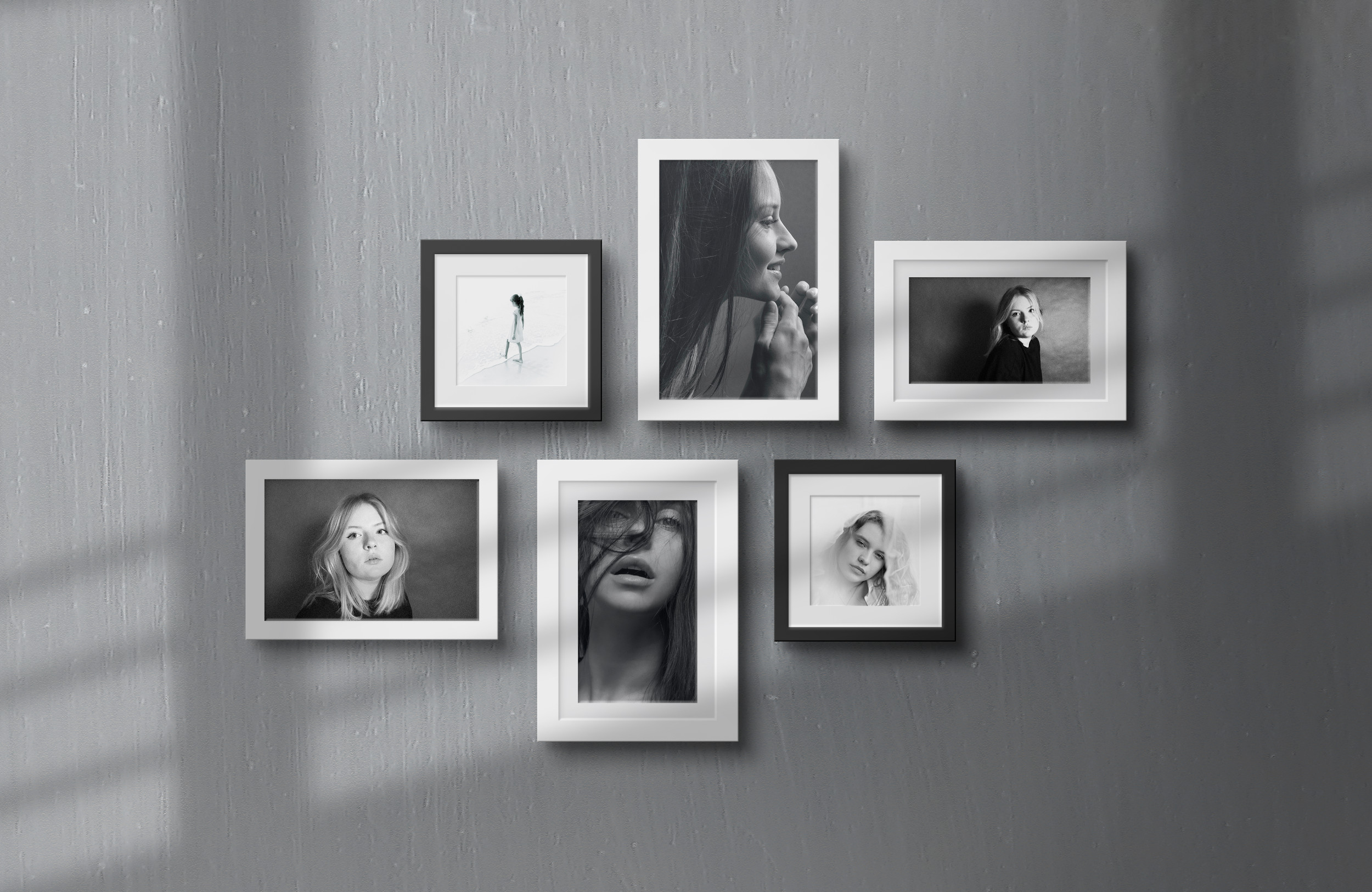
Gallary walls are a great way to spice up your walls and put your mark of individuality into your home. The way you hang you pictures can make or break the look and feel. I found this great video for you on how to hand a gallery wall and make it look amazing, all without measuring a thing. You can follow along the video with a full transcript below. Enjoy.
Hi, I’m Tessa! I work at Framebridge. I’m going to hang a gallery wall today and I’m going to do it in a way that’s sort of disorganized. I know we often like to show you exactly how to do it and make it perfect, but I happen to have lot of frames I think are gonna look really good together and I’ve decided I’m just gonna go for it with this huge wall that we have.
So I’ll tell you my tips and tricks along the way. The one I’m doing right now is not going to be a wall where I planned it all out to begin with. As you can see I actually already have these frames.
So I didn’t frame them ever with the intention of hanging them together, but having worked at Framebridge for so long I realized recently that I happen to have a lot of frames that look really good together and even a lot that are in the same frames.
Specifically this one called Richmond, this sort of an antiqued gold moulding. So I decided that I’m gonna make this gallery wall from lots of gold, white and black frames and I’m not going to use any wood frames in this.
The other thing is as I’m thinking of the arrangement I like to play with the different places that your eye can go on the wall. Normally when I’m doing a gallery there is sort of a natural place for your eye to go.
It has weight, visual weight, either because the art is really interesting or bright or something catches your attention about it. Or everything else in the styling is pointing toward it with this wall because I’m really going to try to just fill up the wall, I almost want to try to spread out the points of interest so you don’t immediately see it.
It’s almost more like a wallpaper, it’s a backdrop to the other things that are gonna be in front of it. So I’m gonna mark the top of this desk and that’s really the only measuring I’m gonna do for this whole thing.
I’m just gonna hang them as they go and think of how I do it as I go. All right so the ones I definitely want to use I’m going to lay out on my table and I’m going to start to visualize them! I like about two inches between each frame and I like to think of the alignment of the frames as significant.
So any frame that you’re placing between two other frames is either left, right or centered as it as it relates to the frames above and below it and it’s either top, bottom or centered as it relates to the ones on either side of it.
So thinking about those things is really important and will help your wall feel well-balanced and spaced out. Another thing that I always think about is…you’re gonna laugh and I’m sure I’m gonna run into this if I do something wrong, but the worst thing in my mind is when you have four frame corners coming together in one spot.
I try really hard to avoid those things. I keep about two inches between everything. Move the art and the frames. Space them out in the design so that color is balanced. And none of the frames that I am including are like this, but if you have one with a really big wide moulding, it can be really beautiful to include that, but think about that as part of the visual weight of the art.
That’s going to garner a lot of attention and eye space or mind space when you see it. If you’re putting one of those in think about other things you can layer in front of it and sort of separate it out from another area which may also grab peoples interest.
All right here we go! I’m just going to start. So my trick to do this is without putting anything in the wall. Is just like… I measure down from the top of the frame using my finger and then I know where I want it to go on the wall.
Center about half an inch down from the bottom of my finger right now. This is my very imprecise method. Oh my gosh, oh my gosh… I just realized this is exactly what I was describing. Four corners almost perfectly lined up.
I cannot stand for this! All right! I mean this is it. I’m pretty happy with it! Here, I’ll show you the whole space. You can see my Diet Coke. Not bad! I’m excited. I think this is going to inspire me.
I think the keys here are: using spacing correctly, thinking about art and styling and how that actually is going to play with your design – like, what it’s all going to look like together once it’s set up rather than how each thing looks on its own before it’s in a practical use setting.
Okay I think that’s it… Oh! Important reminder – we didn’t actually measure anything! I I have my measuring tape here, but we didn’t use it. So I don’t know if this means I’m extremely particular and a perfectionist or I’m not one at all, but in the end I’m happy with how this turned out! Thank you!

